
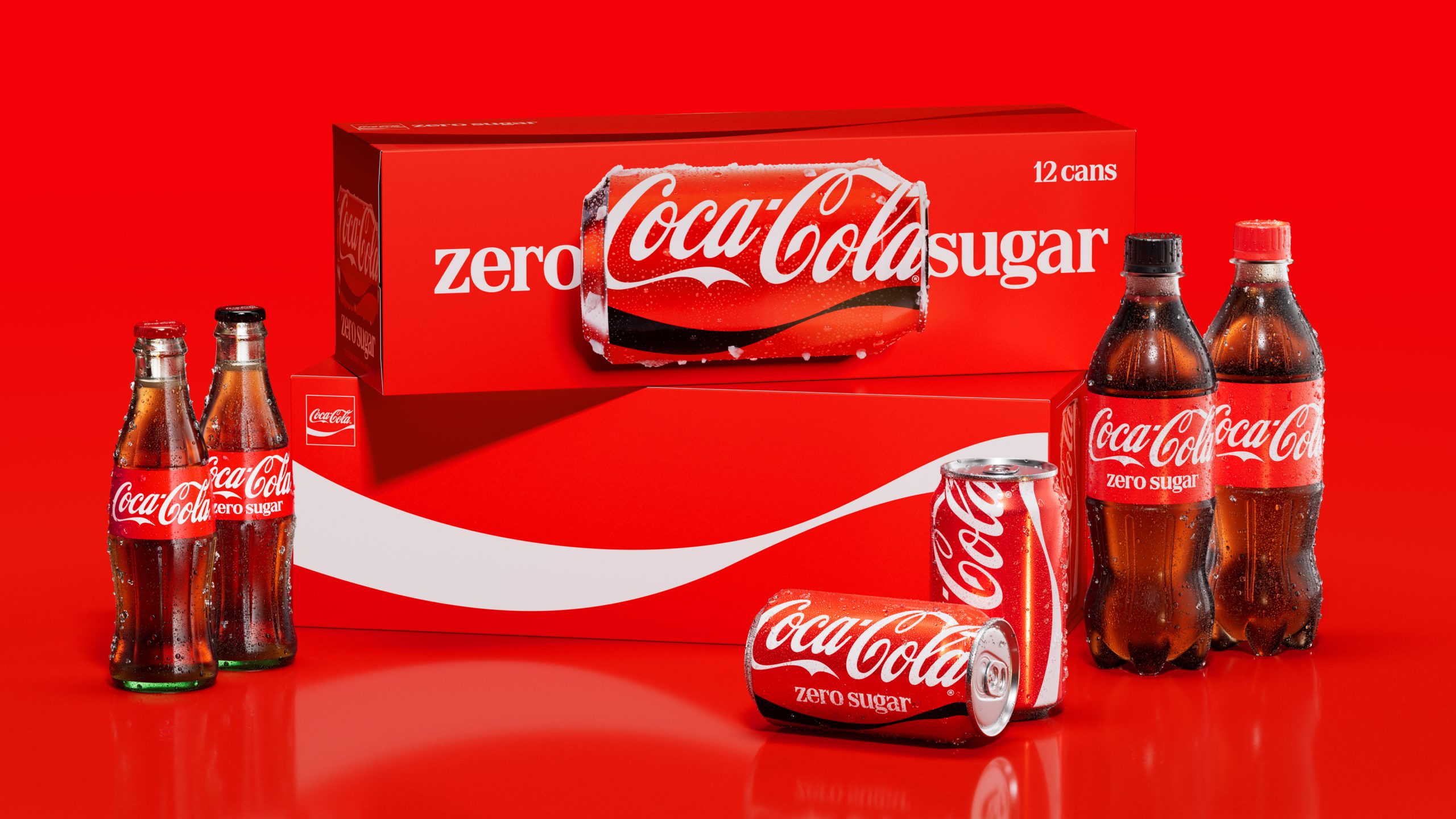
- Coca-Cola is rolling out a unified global visual identity system that features vertical wordmarks on cans, horizontal can imagery on multipacks, and a redesigned Coke Zero Sugar look utilizing white logos and serif typography.
- Developed in collaboration with JKR, Superultrarare, and Brody Associates, the refresh leverages Adobe-powered “Design Intelligence” tools (Project Fizzion) trained on the brand’s archives to scale capabilities and ensure consistent global design governance.
For over 100 years, Coca-Cola has set the standard in how soft drinks—hell, every drink—are branded and marketed. As the legend goes, in 1915, the Coca-Cola Bottle Association issued a challenge to glass bottling companies across the US, seeking a vessel “so distinctive that it could be recognized by touch alone and so unique it could be identified when shattered on the ground.” Go even further back, and Frank M. Robinson, bookkeeper and partner of Coca-Cola inventor John S. Pemberton, thought the brand name sounded nifty, and that two “Cs” would look pretty swell. He wrote out the name in a Spencerian script, and they had a trademark.
The rest, of course, is history. Plenty of brands will try to tell you that they’re iconic, and rest assured—they’re absolutely not. Coca-Cola? That’s actually iconic. And you can thank a glass manufacturer and the guy in payroll (who was a marketing genius).